Web page

web page HSI lighter teal blue png web page HSI png for blog

wood 2 tone HSI webpage with fontwood background hsi 5 wood-background HSI 2 pngwood-background HSI 4wood-background HSI 6 pngwood-background HSI 3 png

Above are some ideas that I played with for the entrance page of the High Seas ink website. The wood texture came in when I realised the teal colours were too plain and looked boring. The wood works with the nautical theme too as driftwood is a type of wood that washes up on the shores of beaches from the ocean. The wood adds depth and texture to the entrance page, and makes it look more well rounded. I had a play with the opacity and fill of the teal layer on top of the wood as I didn’t want it to look like an extra layer, I wanted it to mix naturally with the wood.

wood enter page web

Logo finished design and colour palette

hsi to show dan


This is the finished logo for High Seas Ink. It has been vectorised in Adobe Illustrator so can be blown up to much larger sizes, this would be ideal if High Seas Ink ever decides to use billboards as a form of advertisement. The logo was designed to incorporate both nautical themes, which the business specialises in, and tattoos. The result was this logo which is the merging of an anchor, a ships wheel and a tattoo needle. I think that this logo very much signifies High Seas Ink as being a boutique tattoo parlour which specialises in nautical themes.

colour swatch

My colour swatch was designed with the nautical theme in mind. The blues are to signify the ocean, but there is a variety of blue because I wanted High Seas Ink to still look fresh and inviting, so the customers don’t get bored of seeing the same blue hue on everything. The light blue is to keep High Seas Ink looking fresh and inviting as tattoos can sometimes seem scary and uninviting. The light blue was designed to calm customers who might be new to the tattooing universe. The teal blue was used as this is quite an appealing colour and it closely resembles the deep blue/green hue of the ocean. It also works really well with the other colours. The dark grey was chosen because it is more inviting than black but still has that edgy feel to it that some people look for in tattoos. The lighter teal was chosen because it sits in between the dark teal and light blue so is a nice middle ground for the blue hues used. It also makes the transition between to the two colours smoother and makes the whole palette run smoothly and is pleasing to the eye. The aesthetics of this colour palette are very pleasing especially as it ties in with the nautical theme and teal blue is seen as quite a fancy colour. Tibetan monks also believed that teal was symbolic of the infinity of the sea and the sky (http://www.thejewelryhut.com/html/thecolorstoryofteal.html) which is good as teal in this colour palette is being used to represent the ocean.

Typeface hand drawn design

IMG_3730

When I started designing my logo I looked at designing a logo typeface for it. I thought that since High Seas Ink carries connotations of the ocean, I looked at pirate fonts and older styles from the 1800’s when Britain had a large fleet of ships. I found a type face that I really liked but it had too much decoration on it for the image I want High Seas Ink to have, so I drew I out and corrected the decoration and made parts of the font wider so it could be read easily  form a distance. The original font is in the scrapbook that accompanies this blog.

I like the font I drew out but I get the feeling that it is too simple and something like a handwritten font may suit the brand image better. I like the fact that this font is all in capital letters as it would make the name ‘High Seas Ink’ easier to see and be more distinctive, almost as if the business was shouting at the customer, being assertive and saying ‘ we are the best’.


Logo and colour

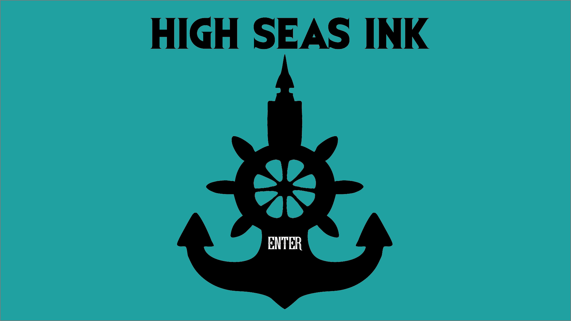
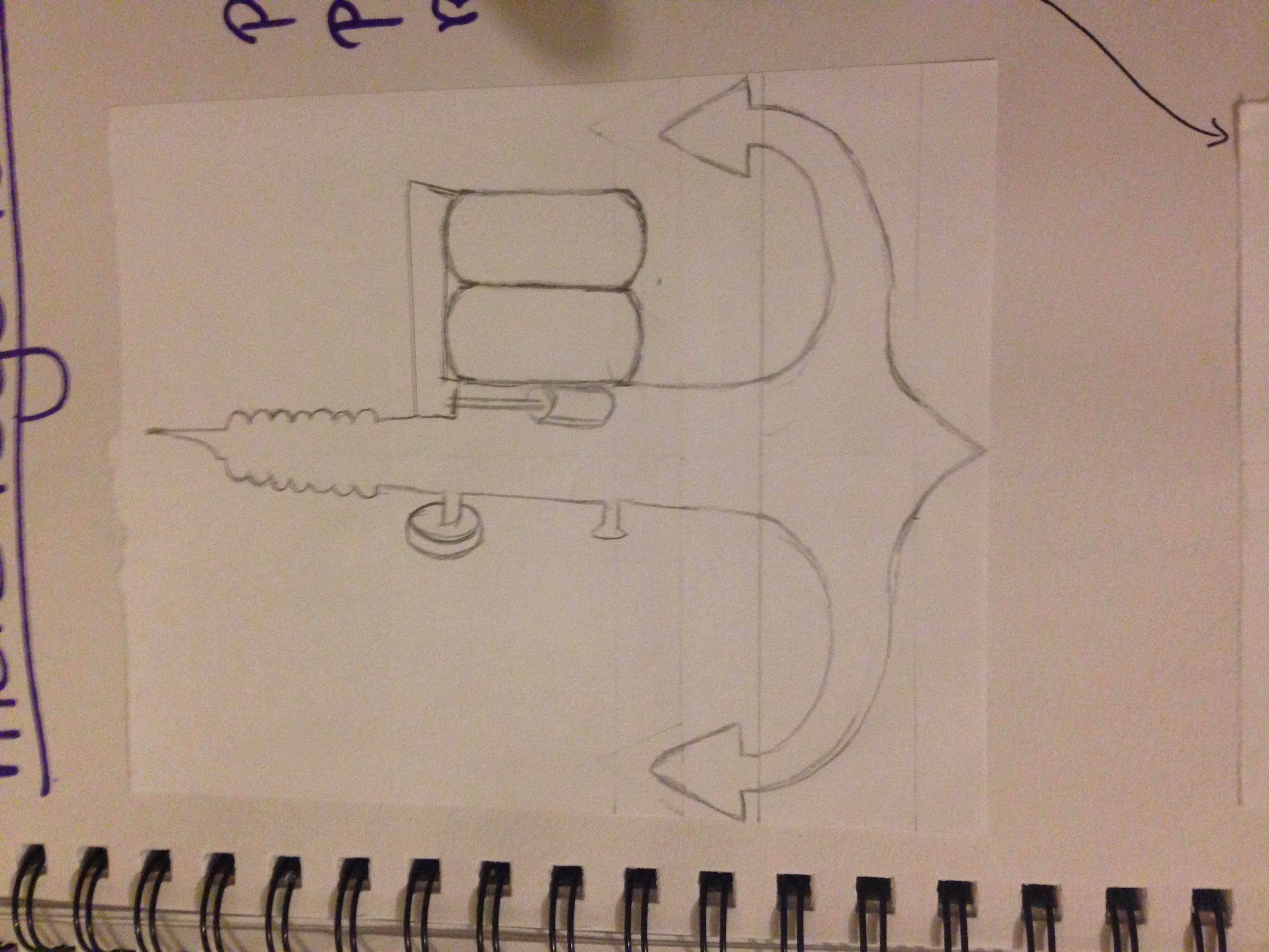
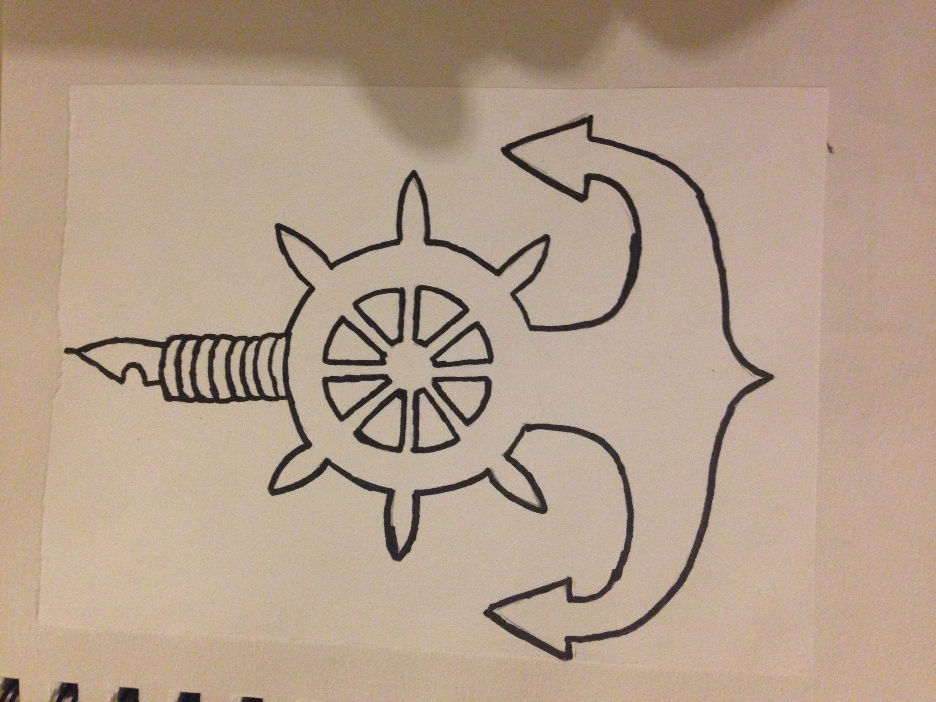
After a lecture on logos and colour I decided to look at the impact of changing existing logo’s colours. I wanted to see if it signified different things to the audience, and I wanted to experiment with colour to help me move towards a colour palette for High Seas Ink. I even made a swatch of different shades of blue for the Facebook logo and even a slight adjustment in tone can really make a difference.

Logo mess about for blog

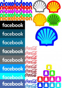
The Nickelodeon logo was originally orange. It is a well known logo to young viewers of the channel, and is easily recognisable. However, if you change the colour to a bright green it looks odd and out of place as a children’s television channel. The colour green usually signifies nature and energy (http://www.bourncreative.com/meaning-of-the-color-green/) so doesn’t really fit in with a TV channel, especially since Nickelodeon shows a lot of cartoons which mean children are more likely to stay in than go outside.

If you change the logo to a purple and pink colour it still looks suitable for a children’s television channel. I think the brightness of the pink, the fluorescence it has really screams for younger people. The red also works but the colour red often carries connotations of danger and worry, so it might not be suitable for the purpose of a children’s television channel.  The blue could work but it looks to calm to be associated with a children’s television channel.

Next is the Facebook swatch with different shades of blue. The bottom logo is the original version. The black version looks very dark and kind of uninviting so i can understand why that is not used as their logo. The next darkest shade (what I call tumblr blue) does look inviting but it doesn’t jump out as if to say “use me, use me!” your eyes aren’t immediately drawn to it so it wouldnt work for a social networking site logo. The next colour down would work I think, if facebook was aimed at people aged 30 and over. I feel like this shade of blue is a little too classy for a social networking site that people aged 13 and above can use.

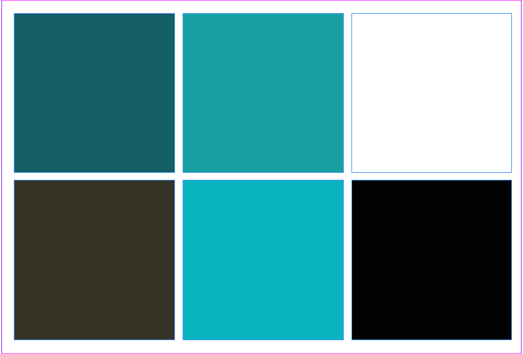
The grey blue shade below that is quite plain as there is only a hint of blue so it wouldn’t stand out to me in the app store and I wouldn’t associate this shade with a social network site, I feel its a little grungy/edgy for that purpose – it might be a good choice for my colour palette for high seas ink though! the grey version of the Facebook logo is too plain and simple for something that is supposed to entertain its users and be a thing that people want to use. The twitter blue version of the logo does appeal to a social network audience as it is eye catching. But in comparison to the actual logo the original logo looks a lot classier and more secure, which since people are putting personal details up will be important. The turquoise version of the logo looks too bright and childish to be an app for adults (in my opinion).

For the Coca Cola logo I went three shades lighter and three shades darker to show again that tone is important. I also made two of the Coca Cola logo in blue to show how different logos can look depending on the colours used. Red is a very fiery colour; often associated with, passion, danger and excitement. Blue is quite a cool colour; often associated with, water, trust and intelligence. The Coca Cola logo in blue sends a very different message. the two blue versions to me, matched with the typography used, remind me water, air and nature. It would work if Coca Cola ever brought out bottled water.

The shell logo was done just to show how different and wrong logos can look if the wrong colour palette is used. The green and orange versions look awful to me. The blue isn’t too bad but isn’t suitable for a petrol company. The grey and white works but it is not eye catching and wont draw people in. The snap chat logo again just shows how different it can look. I personally think all bright shades of colours would work for snap chat and I really like all the versions produced.

Logo Ideas

Signify.

My logo has to signify High Seas Ink. High Seas Ink is a boutique tattoo parlour which specialises in nautical themes. How do you signify that? A tattoo gun would signify the tattoo parlour. An anchor or some other ocean related object would signify a nautical theme. An idea would be to combine the two to signify both tattoo parlour and specialising in a nautical theme. But then how do you fit in the Boutique part? Is it really necessary to signify boutique through the logo? No I don’t think it is, not if that mean compromising a simple and effective logo. The boutique part will be featured on both the website and the brochure so is not really a vital thing that needs to be put in the logo.

I started designing my logo with the nautical theme. An anchor to me fit nicely when being combined with a tattoo gun. But for now I just needed to work on getting proportions right and seeing what the objects look like apart and if they will work together.

IMG_3731 IMG_3732 IMG_3733


I realised that I cant draw the Ink holders of the tattoo gun so I decided to replace it with something else nautical themed that would fill out the logo and keep it balanced.

IMG_3734 IMG_3735 IMG_3736 IMG_3737