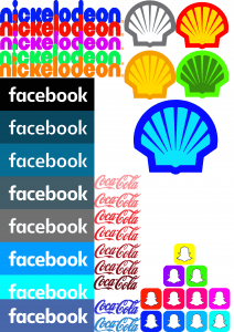
After a lecture on logos and colour I decided to look at the impact of changing existing logo’s colours. I wanted to see if it signified different things to the audience, and I wanted to experiment with colour to help me move towards a colour palette for High Seas Ink. I even made a swatch of different shades of blue for the Facebook logo and even a slight adjustment in tone can really make a difference.
The Nickelodeon logo was originally orange. It is a well known logo to young viewers of the channel, and is easily recognisable. However, if you change the colour to a bright green it looks odd and out of place as a children’s television channel. The colour green usually signifies nature and energy (http://www.bourncreative.com/meaning-of-the-color-green/) so doesn’t really fit in with a TV channel, especially since Nickelodeon shows a lot of cartoons which mean children are more likely to stay in than go outside.
If you change the logo to a purple and pink colour it still looks suitable for a children’s television channel. I think the brightness of the pink, the fluorescence it has really screams for younger people. The red also works but the colour red often carries connotations of danger and worry, so it might not be suitable for the purpose of a children’s television channel. The blue could work but it looks to calm to be associated with a children’s television channel.
Next is the Facebook swatch with different shades of blue. The bottom logo is the original version. The black version looks very dark and kind of uninviting so i can understand why that is not used as their logo. The next darkest shade (what I call tumblr blue) does look inviting but it doesn’t jump out as if to say “use me, use me!” your eyes aren’t immediately drawn to it so it wouldnt work for a social networking site logo. The next colour down would work I think, if facebook was aimed at people aged 30 and over. I feel like this shade of blue is a little too classy for a social networking site that people aged 13 and above can use.
The grey blue shade below that is quite plain as there is only a hint of blue so it wouldn’t stand out to me in the app store and I wouldn’t associate this shade with a social network site, I feel its a little grungy/edgy for that purpose – it might be a good choice for my colour palette for high seas ink though! the grey version of the Facebook logo is too plain and simple for something that is supposed to entertain its users and be a thing that people want to use. The twitter blue version of the logo does appeal to a social network audience as it is eye catching. But in comparison to the actual logo the original logo looks a lot classier and more secure, which since people are putting personal details up will be important. The turquoise version of the logo looks too bright and childish to be an app for adults (in my opinion).
For the Coca Cola logo I went three shades lighter and three shades darker to show again that tone is important. I also made two of the Coca Cola logo in blue to show how different logos can look depending on the colours used. Red is a very fiery colour; often associated with, passion, danger and excitement. Blue is quite a cool colour; often associated with, water, trust and intelligence. The Coca Cola logo in blue sends a very different message. the two blue versions to me, matched with the typography used, remind me water, air and nature. It would work if Coca Cola ever brought out bottled water.
The shell logo was done just to show how different and wrong logos can look if the wrong colour palette is used. The green and orange versions look awful to me. The blue isn’t too bad but isn’t suitable for a petrol company. The grey and white works but it is not eye catching and wont draw people in. The snap chat logo again just shows how different it can look. I personally think all bright shades of colours would work for snap chat and I really like all the versions produced.

Leave a comment