John Dolan photography

JD1 JD2

John Dolan photography has that dark,mysterious yet also smart and serious feel to it that I think a good brand should have. A good brand in my eyes should be memorable for being different to existing brands. John Dolan photography uses a dark colour palette, which is what I want for my Brand High Seas Ink. I like that it uses a dark grey instead of just black, this sort of gives it a lift in my opinion as black tends to signify negative things to a lot of people. The dark grey also looks nice and sends off a sophisticated vibe. I think I will use the dark grey or similar in my colour palette for High Seas Ink.


NYC Media Lab

https://www.behance.net/gallery/NYC-Media-Lab/2908577

NYC media lab was interesting to me because it showed me examples of website design to fit in with the Brand identity.

The main colour palette for this brand package is; purple, pink,blue and green. With purple being the main colour used to create the brand identity. You can see this because only purple and white are used on the tablet screen and on the posters/business cards. The blue, pink and green are introduced in an info graphic that explains what the business does. This may be because I wouldn’t know exactly what the business does from just looking at the posters, business cards and App screen.

The brand font they use is big and bold and stands out against the purple background. The branding is simple but effective with purple and the brand font being used effectively. It creates the sense of a brand identity, The way everything is the same theme. The website looks clean and tidy. It’s simple but it is strong in its’ identity. If I saw that shade of purple I would instantly think NYC media lab.

NYC media 1

LT burgers

I liked this branding package because it uses quite a bright colour palette to create a brand identity. The bright colour palette drew me in and made me want to pay attention and look at this more. This branding package was designed by an artist called Mark Brooks (http://www.markbrooksgraphikdesign.com). I looked into some more of his work.

What his site says about this identity package- “Identity design and Branding for the LT Burger restaurant in Bryant Park, Manhattan. LT Burger specialises in high quality hamburgers made by renowned chef Laurent Touroundel.” Looking at the rest of his work this identity package is quite different from some of his other work – this was probably to meet the expectations of his client.

Lt1


Corporate identity packages research

I had a look into corporate identity packages not related to tattoo boutiques to try and cover a wide range of ground and look at what makes a good corporate identity package. I found that having a recognisable logo is a must as this will go on all things in the corporate identity package.

one of the corporate identity packages I looked as was Mareiner Holz. I liked this package because the channelling of organic and natural things was used throughout. This relates back to their trade which is handmade furniture. It also showed how they redesigned the old logo to make it more understated and natural as opposed to the bright block it was before.  This corporate identity package used natural colours on all platforms this keeps with the natural and organic look the business is going for. It uses a natural colour scheme.

Mariner Holz


The next corporate identity package I looked into was The Voyager Cafe.

voyager 1voyager 3voyager 2

I liked this corporate identity package because it was simple and understated. It used a recurring theme of red and white stripes which works really well as cafe colours. There is use of an ocean theme as well which fits in with the Cafes’ name ‘the Voyager’. This corporate identity package really stands out to me as I have chosen the High Seas Ink brief. High seas ink is a boutique tattoo parlour which specialises in nautical themes.


Corporate Identity – research

To accompany this blog at hand in there will be a portfolio that also documents this brief.

I started by choosing the Tattoo boutique brief. I chose this brief because I have an interest in tattoos. I then researched existing tattoo boutique websites.

The first was called Chic Ink Boutique. This site was really feminine and aimed at a higher class audience. The over use of fancy fonts and the phrase “powerful and feminine” hints at this. The site had a house style of colours, using; white, grey and gold. This business markets itself as unique you can see this by the phrase “express yourself”. Tattoos are featured on the website – this is done to show what trade the business is in, to make it clear that it is a boutique tattoo business. The background is a simple white this may have been done to keep the site from looking to overcrowded or too busy. Simplicity suits this site as sometimes the text and text boxes look a little messy. The use of fancy fonts may be related to the use of fancy fonts in tattoos. Fancy also suits boutique as it is a word often associated with class and privilege.

http://www.chicinkboutique.com

The next site I looked at was called King Of Hearts. This site was more what I would expect of a tattoo business but it seemed to have lost the finesse of the boutique part. However, the fancy font was still present which again may be related to the fact that fancier fonts are often used in tattoos. There was a house style consisting of three main colours; green, white and red. Again there were tattoos featured on the website to show what trade the business is in.

http://www.kingofheartslondon.co.uk

The next site I looked at was Tattoo Boutique. This site had a very basic design and used grids for the layout. The design is basic because it has minimal interactivity and is not very aesthetically pleasing to the eye. in places it looks childish. The overuse of a fancy font and use of cartoon clip art pictures does not give off a very boutique feel.  There is a house style of three colours; green, blue and white.  Tattoos are featured on this site as well however they could be displayed more elegantly.

http://tattooboutique121.wix.com/tattooboutique

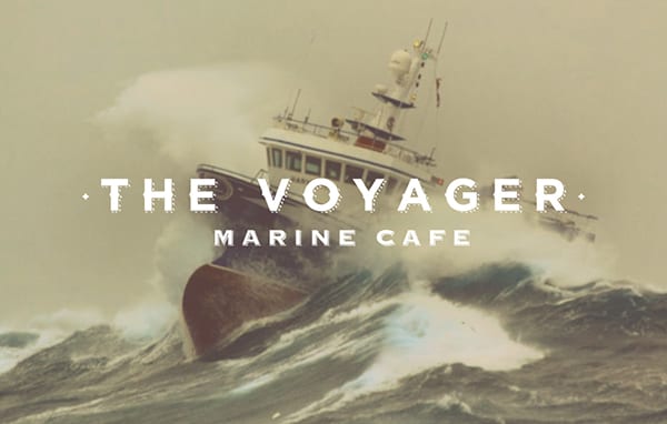
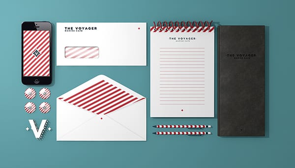
Overall, The sites I looked at have given me some ideas and shown me what I want to avoid. I think with the business name of High Seas Ink I might move towards a blue colour scheme as this might signify the ocean. I will aim to design a ship or anchor to use as the logo,but my drawing skills are not the best. I am going to look into normal corporate identity packages to see if I can get any more ideas and help.