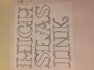
When I started designing my logo I looked at designing a logo typeface for it. I thought that since High Seas Ink carries connotations of the ocean, I looked at pirate fonts and older styles from the 1800’s when Britain had a large fleet of ships. I found a type face that I really liked but it had too much decoration on it for the image I want High Seas Ink to have, so I drew I out and corrected the decoration and made parts of the font wider so it could be read easily form a distance. The original font is in the scrapbook that accompanies this blog.
I like the font I drew out but I get the feeling that it is too simple and something like a handwritten font may suit the brand image better. I like the fact that this font is all in capital letters as it would make the name ‘High Seas Ink’ easier to see and be more distinctive, almost as if the business was shouting at the customer, being assertive and saying ‘ we are the best’.
