https://www.behance.net/gallery/NYC-Media-Lab/2908577
NYC media lab was interesting to me because it showed me examples of website design to fit in with the Brand identity.
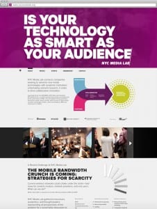
The main colour palette for this brand package is; purple, pink,blue and green. With purple being the main colour used to create the brand identity. You can see this because only purple and white are used on the tablet screen and on the posters/business cards. The blue, pink and green are introduced in an info graphic that explains what the business does. This may be because I wouldn’t know exactly what the business does from just looking at the posters, business cards and App screen.
The brand font they use is big and bold and stands out against the purple background. The branding is simple but effective with purple and the brand font being used effectively. It creates the sense of a brand identity, The way everything is the same theme. The website looks clean and tidy. It’s simple but it is strong in its’ identity. If I saw that shade of purple I would instantly think NYC media lab.
