Web page 2.0

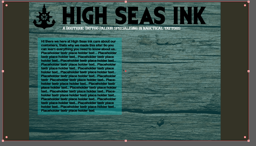
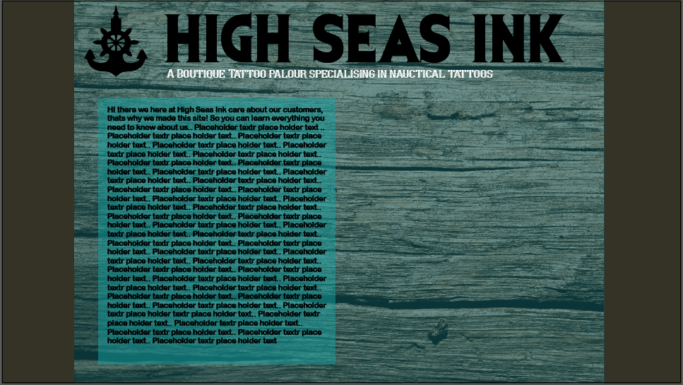
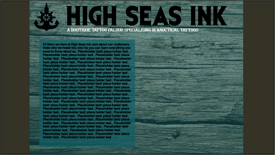
Once you click the ‘enter’ button on the welcome page you will get taken to this page. The main screen of High Seas Inks’ website.

web page 2 1st snip web page 2 2nd snip white tag line


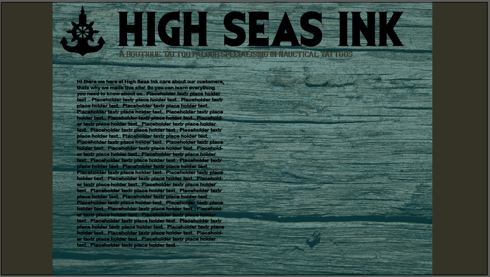
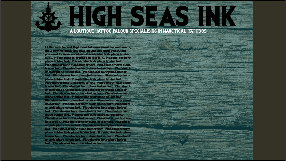
I stuck with the wood and used the colour palette to fill out the sides to make it look more like a traditional web page. One problem with a textured background is that text can sometimes struggle to be clear. With the tag line the use of the colour white fixed legibility. However, with the paragraph text something more was needed. i decided to try a text box in the varying shades of blue of the High Seas Ink colour scheme. The lighter blue turned out to contrast with the text and wood/teal background well. The lighter blue doesn’t over power the page or make it too bright as a text box. However, I feel if I turn the opacity down just a tad it will add more depth to the page as you will be able to see the wood texture but with limited visibility.

light teal smaller coprect text box light teal text box hsi web page 2

smaller box less opacity hsi web page 2 text box teal hsi web page 2

Web page

web page HSI lighter teal blue png web page HSI png for blog

wood 2 tone HSI webpage with fontwood background hsi 5 wood-background HSI 2 pngwood-background HSI 4wood-background HSI 6 pngwood-background HSI 3 png

Above are some ideas that I played with for the entrance page of the High Seas ink website. The wood texture came in when I realised the teal colours were too plain and looked boring. The wood works with the nautical theme too as driftwood is a type of wood that washes up on the shores of beaches from the ocean. The wood adds depth and texture to the entrance page, and makes it look more well rounded. I had a play with the opacity and fill of the teal layer on top of the wood as I didn’t want it to look like an extra layer, I wanted it to mix naturally with the wood.

wood enter page web