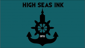
This is the finished logo for High Seas Ink. It has been vectorised in Adobe Illustrator so can be blown up to much larger sizes, this would be ideal if High Seas Ink ever decides to use billboards as a form of advertisement. The logo was designed to incorporate both nautical themes, which the business specialises in, and tattoos. The result was this logo which is the merging of an anchor, a ships wheel and a tattoo needle. I think that this logo very much signifies High Seas Ink as being a boutique tattoo parlour which specialises in nautical themes.
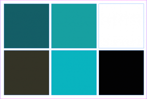
My colour swatch was designed with the nautical theme in mind. The blues are to signify the ocean, but there is a variety of blue because I wanted High Seas Ink to still look fresh and inviting, so the customers don’t get bored of seeing the same blue hue on everything. The light blue is to keep High Seas Ink looking fresh and inviting as tattoos can sometimes seem scary and uninviting. The light blue was designed to calm customers who might be new to the tattooing universe. The teal blue was used as this is quite an appealing colour and it closely resembles the deep blue/green hue of the ocean. It also works really well with the other colours. The dark grey was chosen because it is more inviting than black but still has that edgy feel to it that some people look for in tattoos. The lighter teal was chosen because it sits in between the dark teal and light blue so is a nice middle ground for the blue hues used. It also makes the transition between to the two colours smoother and makes the whole palette run smoothly and is pleasing to the eye. The aesthetics of this colour palette are very pleasing especially as it ties in with the nautical theme and teal blue is seen as quite a fancy colour. Tibetan monks also believed that teal was symbolic of the infinity of the sea and the sky (http://www.thejewelryhut.com/html/thecolorstoryofteal.html) which is good as teal in this colour palette is being used to represent the ocean.


Leave a comment