Type for High Seas Ink


evil dead png font show#

The above evil dead font is what I chose to be the main font for High seas Ink. The company name looks good and readable in this font and it suits the logo well. This logo looks good in all sizes and is a good choice for the main font for this business. A good readable font means that the business will be easily recognised from a distance.

Young heart font


The above font is the young hearts font. This was chosen because I wanted a more detailed font to show that High seas Ink pays attention to detail. As a tattoo parlour this is an important message to convey to the customers and I think that the young hearts font has the correct amount of detail and legibility to convey this message. This font will be used for the tag line and menu options on the site and the tag line and contact details on the brochure.

arial font show png


This font is the font I have chosen to use for the chunky bits of text like the introductory paragraphs. It is easy to read and can be used on almost any background. This font goes with everything so is an ideal font for infill text.

Web Page 2.0 part 2

web page 2 3rd snip


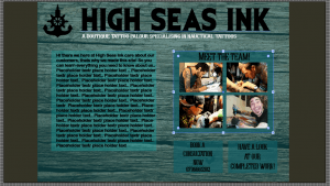
I added a meet the team page as tattooing can be quite a personal experience and High Seas Ink want to market it as such. A meet the team page shows the customer the team and lets them know a bit about each individual team member, which should help them feel informed about the team at High Seas Ink, which should put them at ease about choosing to have their tattoo done at High Seas Ink. I started using the full range of blues from the colour palette as the background for text boxes but it looked mismatched and out of sync. So I decided to use the lighter blue with a 70% opacity as it would contrast with the teal/wood background and it is easier to read the black text off of. The book a consultation link is for customers to easily contact high Seas Ink to enquire about their tattoos and book a consultation to carefully plan their tattoo journey with High Seas Ink. The see our completed work is so that potential customers can have a look at some of High Seas Ink previous accomplishments. I plan to have a store page also.

web page 2 snip 4

Web page 2.0

Once you click the ‘enter’ button on the welcome page you will get taken to this page. The main screen of High Seas Inks’ website.

web page 2 1st snip web page 2 2nd snip white tag line


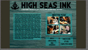
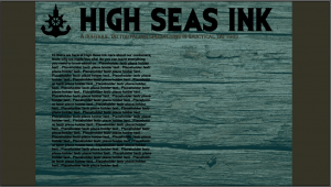
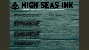
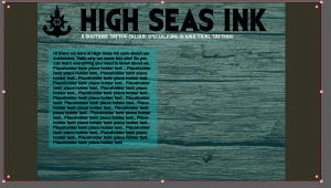
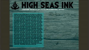
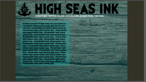
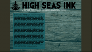
I stuck with the wood and used the colour palette to fill out the sides to make it look more like a traditional web page. One problem with a textured background is that text can sometimes struggle to be clear. With the tag line the use of the colour white fixed legibility. However, with the paragraph text something more was needed. i decided to try a text box in the varying shades of blue of the High Seas Ink colour scheme. The lighter blue turned out to contrast with the text and wood/teal background well. The lighter blue doesn’t over power the page or make it too bright as a text box. However, I feel if I turn the opacity down just a tad it will add more depth to the page as you will be able to see the wood texture but with limited visibility.

light teal smaller coprect text box light teal text box hsi web page 2

smaller box less opacity hsi web page 2 text box teal hsi web page 2

Web page

web page HSI lighter teal blue png web page HSI png for blog

wood 2 tone HSI webpage with fontwood background hsi 5 wood-background HSI 2 pngwood-background HSI 4wood-background HSI 6 pngwood-background HSI 3 png

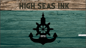
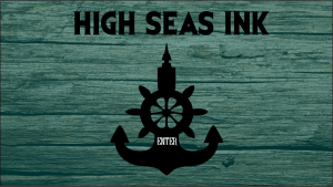
Above are some ideas that I played with for the entrance page of the High Seas ink website. The wood texture came in when I realised the teal colours were too plain and looked boring. The wood works with the nautical theme too as driftwood is a type of wood that washes up on the shores of beaches from the ocean. The wood adds depth and texture to the entrance page, and makes it look more well rounded. I had a play with the opacity and fill of the teal layer on top of the wood as I didn’t want it to look like an extra layer, I wanted it to mix naturally with the wood.

wood enter page web

Logo finished design and colour palette

hsi to show dan


This is the finished logo for High Seas Ink. It has been vectorised in Adobe Illustrator so can be blown up to much larger sizes, this would be ideal if High Seas Ink ever decides to use billboards as a form of advertisement. The logo was designed to incorporate both nautical themes, which the business specialises in, and tattoos. The result was this logo which is the merging of an anchor, a ships wheel and a tattoo needle. I think that this logo very much signifies High Seas Ink as being a boutique tattoo parlour which specialises in nautical themes.

colour swatch

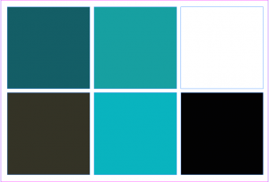
My colour swatch was designed with the nautical theme in mind. The blues are to signify the ocean, but there is a variety of blue because I wanted High Seas Ink to still look fresh and inviting, so the customers don’t get bored of seeing the same blue hue on everything. The light blue is to keep High Seas Ink looking fresh and inviting as tattoos can sometimes seem scary and uninviting. The light blue was designed to calm customers who might be new to the tattooing universe. The teal blue was used as this is quite an appealing colour and it closely resembles the deep blue/green hue of the ocean. It also works really well with the other colours. The dark grey was chosen because it is more inviting than black but still has that edgy feel to it that some people look for in tattoos. The lighter teal was chosen because it sits in between the dark teal and light blue so is a nice middle ground for the blue hues used. It also makes the transition between to the two colours smoother and makes the whole palette run smoothly and is pleasing to the eye. The aesthetics of this colour palette are very pleasing especially as it ties in with the nautical theme and teal blue is seen as quite a fancy colour. Tibetan monks also believed that teal was symbolic of the infinity of the sea and the sky (http://www.thejewelryhut.com/html/thecolorstoryofteal.html) which is good as teal in this colour palette is being used to represent the ocean.