Finished products

So I ran out of time with this brief to create a brochure as well as a web page. However, I did create a few samples of T-shirts that would be in the High Seas Ink online store.

here are the finished products…

swatch for HSI 2 3

the colour swatch is made up of colours that I feel relate to the ocean. This is so that it ties in with the businesses name High Seas Ink. I originally only wanted one shade of blue and the dark grey and black and white however I added more shades of blue so that I could create text boxes if I wanted too. The extra shades of blue would also be useful if I wanted to differentiate between media platforms to keep the company image looking fresh and new.

web page wood background entry page

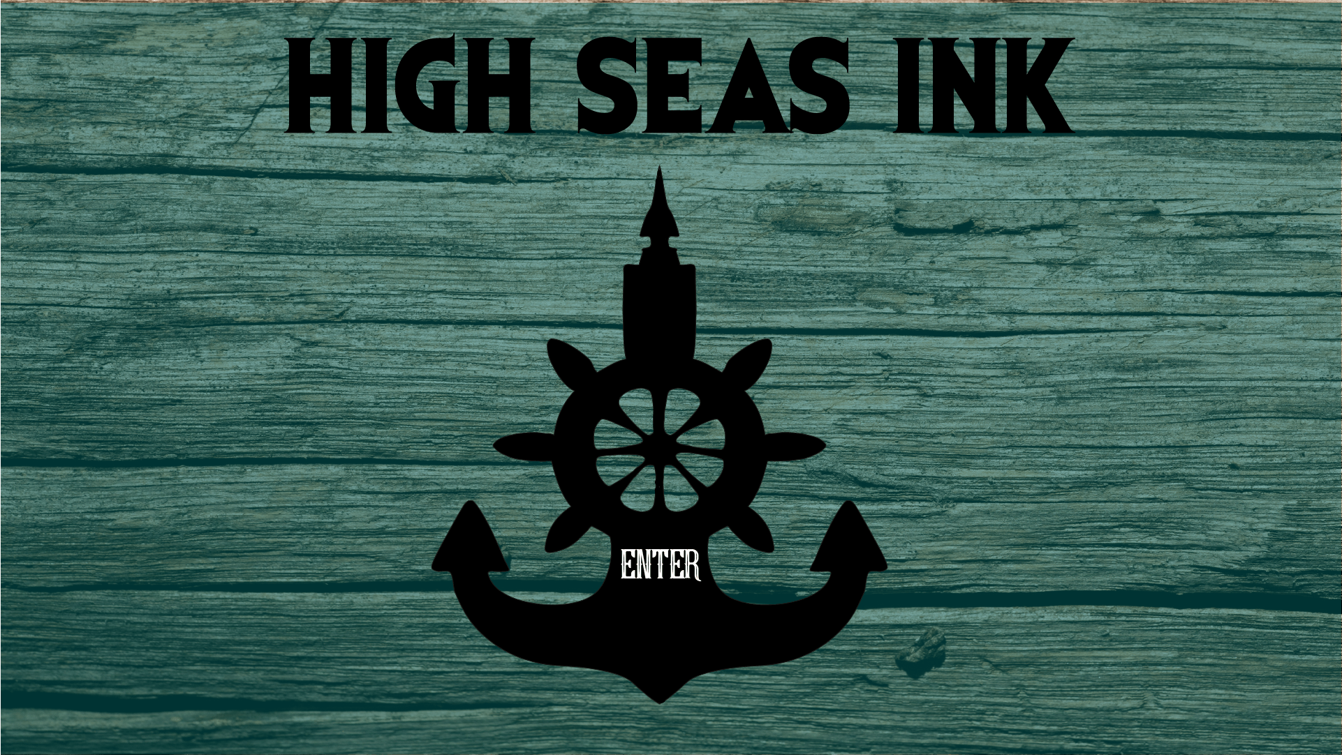
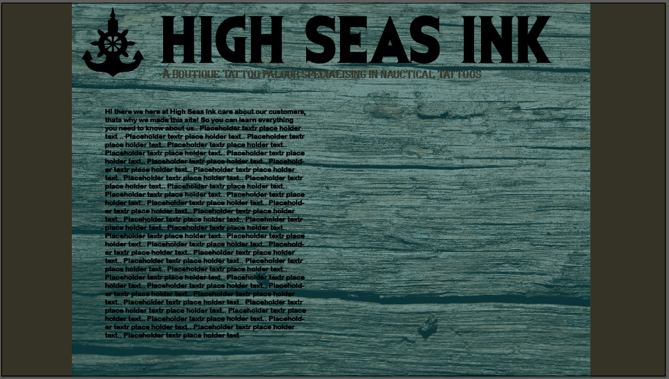
With the entrance page I like the use of the drift wood style texture with the medium opacity overlay in the teal blue from the colour palette. Its quite plain and simple but it pushes the logo in customers faces so they can remember it better. The point of the entrance page is to embed the High Seas Ink logo into customers heads even if they have a quick look then leave the site they will still remember the Logo and name because they are the two focal points of the entrance page.

Web page pg2 wood export for blog

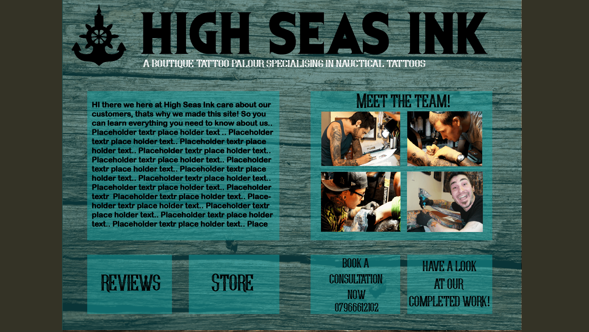
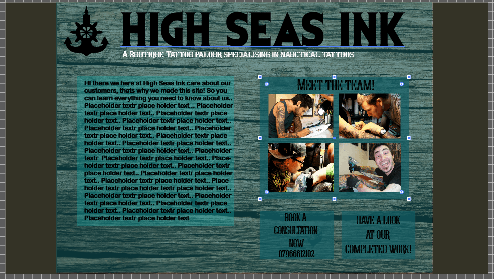
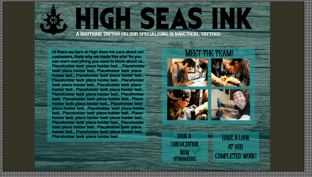
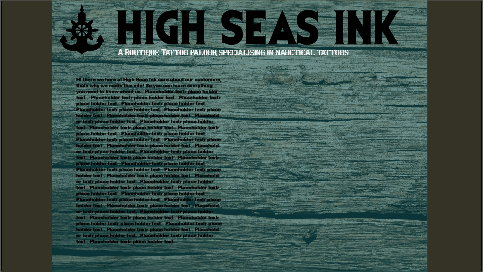
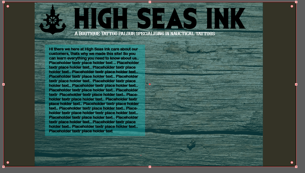
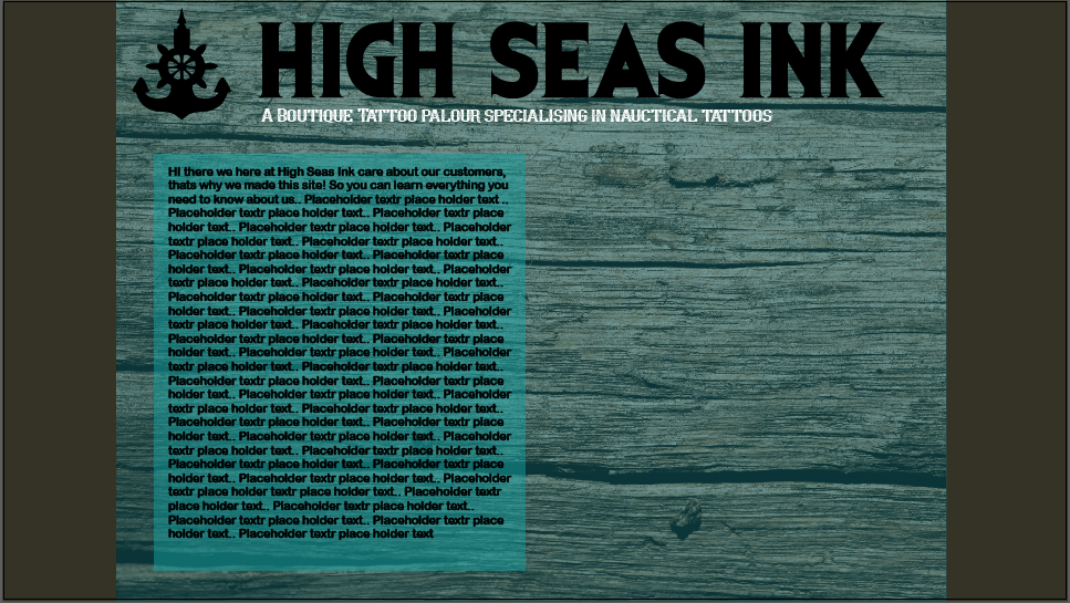
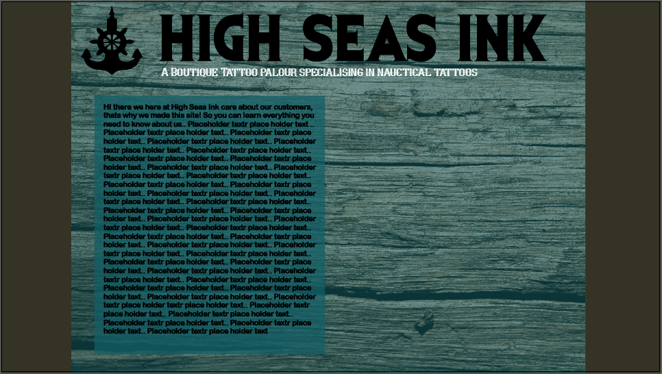
This is the page you are taken too after the entrance page. Its the welcome page for High Seas Ink that has links to the store, the booking service, reviews and shows previous tattoos that the company has done. This page uses all of the colour palette with text boxes and the dark grey as the background. The page is simplistic as if it was to complicated it is unlikely the customers would remember it which would make the site forgettable which would be bad for High Seas Ink as they are trying to become a national chain of boutique tattoo parlours.

tshirts for hsi storetshirt 3


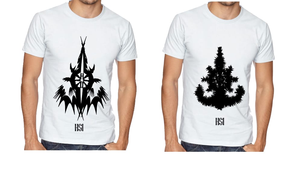
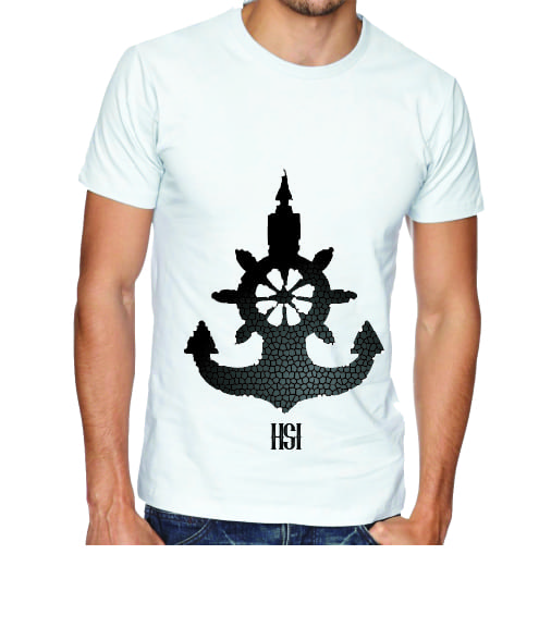
These are the mock ups of the types of brand t-shirts I would have in the High Seas Ink store. The store would be at the front of the shop near the reception area, the t-shirts are also available to order online. The point of the t-shirts is to increase profit for the business. However, the t-shirts with the edited logos will also increase brand awareness amongst customers as they should associate it with High Seas Ink. People who wear the T-shirts will also be doing a bit of free advertising fr the business.

Business Card Mockup  for hand in EXPORT


The business cards fit in with the the house style of the web pages. I wanted to keep the business card simple and understated to not confuse potential customers. I wanted it to be to the point and memorable so that high seas ink could increase brand awareness which would help them to become a national brand. I used the wood effect again as I wanted to keep a house style going across all media platforms. The logo is also on the front side as I want the logo to become the most memorable thing about High Seas Ink as it is their brand. The reverse side of the business card has basic information on it so that the customers don’t feel like they are being bombarded with information.

Type for High Seas Ink


evil dead png font show#

The above evil dead font is what I chose to be the main font for High seas Ink. The company name looks good and readable in this font and it suits the logo well. This logo looks good in all sizes and is a good choice for the main font for this business. A good readable font means that the business will be easily recognised from a distance.

Young heart font


The above font is the young hearts font. This was chosen because I wanted a more detailed font to show that High seas Ink pays attention to detail. As a tattoo parlour this is an important message to convey to the customers and I think that the young hearts font has the correct amount of detail and legibility to convey this message. This font will be used for the tag line and menu options on the site and the tag line and contact details on the brochure.

arial font show png


This font is the font I have chosen to use for the chunky bits of text like the introductory paragraphs. It is easy to read and can be used on almost any background. This font goes with everything so is an ideal font for infill text.

Web Page 2.0 part 2

web page 2 3rd snip


I added a meet the team page as tattooing can be quite a personal experience and High Seas Ink want to market it as such. A meet the team page shows the customer the team and lets them know a bit about each individual team member, which should help them feel informed about the team at High Seas Ink, which should put them at ease about choosing to have their tattoo done at High Seas Ink. I started using the full range of blues from the colour palette as the background for text boxes but it looked mismatched and out of sync. So I decided to use the lighter blue with a 70% opacity as it would contrast with the teal/wood background and it is easier to read the black text off of. The book a consultation link is for customers to easily contact high Seas Ink to enquire about their tattoos and book a consultation to carefully plan their tattoo journey with High Seas Ink. The see our completed work is so that potential customers can have a look at some of High Seas Ink previous accomplishments. I plan to have a store page also.

web page 2 snip 4

Web page 2.0

Once you click the ‘enter’ button on the welcome page you will get taken to this page. The main screen of High Seas Inks’ website.

web page 2 1st snip web page 2 2nd snip white tag line


I stuck with the wood and used the colour palette to fill out the sides to make it look more like a traditional web page. One problem with a textured background is that text can sometimes struggle to be clear. With the tag line the use of the colour white fixed legibility. However, with the paragraph text something more was needed. i decided to try a text box in the varying shades of blue of the High Seas Ink colour scheme. The lighter blue turned out to contrast with the text and wood/teal background well. The lighter blue doesn’t over power the page or make it too bright as a text box. However, I feel if I turn the opacity down just a tad it will add more depth to the page as you will be able to see the wood texture but with limited visibility.

light teal smaller coprect text box light teal text box hsi web page 2

smaller box less opacity hsi web page 2 text box teal hsi web page 2